
Case study
Rebuilding Diamond Peak's whole online presence, from logo to listings.
View the website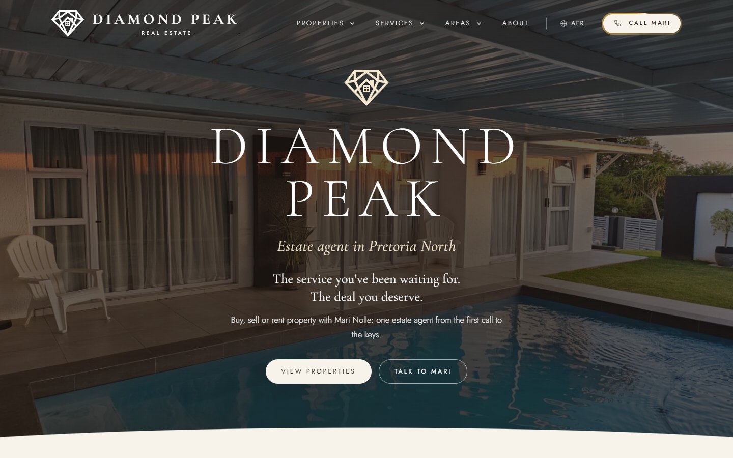
Overview
Mari Nolle spent more than a decade in real estate before starting Diamond Peak, her own agency in Pretoria North. Her service was premium. Her online presence wasn't. I rebuilt everything a client sees: the logo, the website, every property listing, her email signature, and how she shows up when someone searches for property in her area. In English and Afrikaans.
- Client
- Diamond Peak Real EstateMari Nolle, founder
- Where
- Pretoria North, Gauteng
- Website
- View the site ↗
- What I did
- Discovery, logo refresh and logo family, website design and build, property listings, local search pages, Afrikaans version, email signature, brand kit, holiday seasons, bond calculator, blog, legal pages, her own dashboard
- My role
- Strategy, design, build and local SEO
Challenges
- A blurry logo with a drop shadow that couldn't go on a sign or a card.
- A stock beach photo for a Pretoria North agent, and her name unreadable on a phone.
- Not on Google Maps, and invisible when locals searched for property.
- Her personal cellphone number on everything.
Objectives
- A brand that looks as premium as her service.
- Be found by people searching for property in her suburbs.
- Make every property easy to browse, and every enquiry one tap away.
- Speak to buyers and sellers in English and Afrikaans.
The solution
- A refined logo family, sharp from the hero down to a browser tab.
- A website built around Mari and her area, in two languages.
- A page for every service, region and suburb she covers.
- A matching email signature for every email she sends.
What I delivered
pages: 68 in English, 68 in Afrikaans
area and suburb pages, so locals find her
properties, each with its own page and gallery
versions of her logo, from billboard to browser tab
Background
Who is Mari?
Mari is an independent estate agent who covers the whole of Pretoria, with most of her listings in the northern suburbs. She deals with every buyer and seller herself, from the first call to handing over the keys. That personal service is the whole business, so the brand had to feel personal too.
"After a decade in the Real Estate Industry, I have decided to do my own thing. This is the name you must remember."
Mari Nolle, on her original website
The problem
A premium agent with an amateur first impression.
The old site was a stock WordPress theme. The logo was a low-resolution image with a drop shadow, the hero was a stock photo of a beach villa, and on a phone, Mari's name and title sat unreadable over the photo. There was no Google Business Profile, and nothing told Google which areas she worked in.
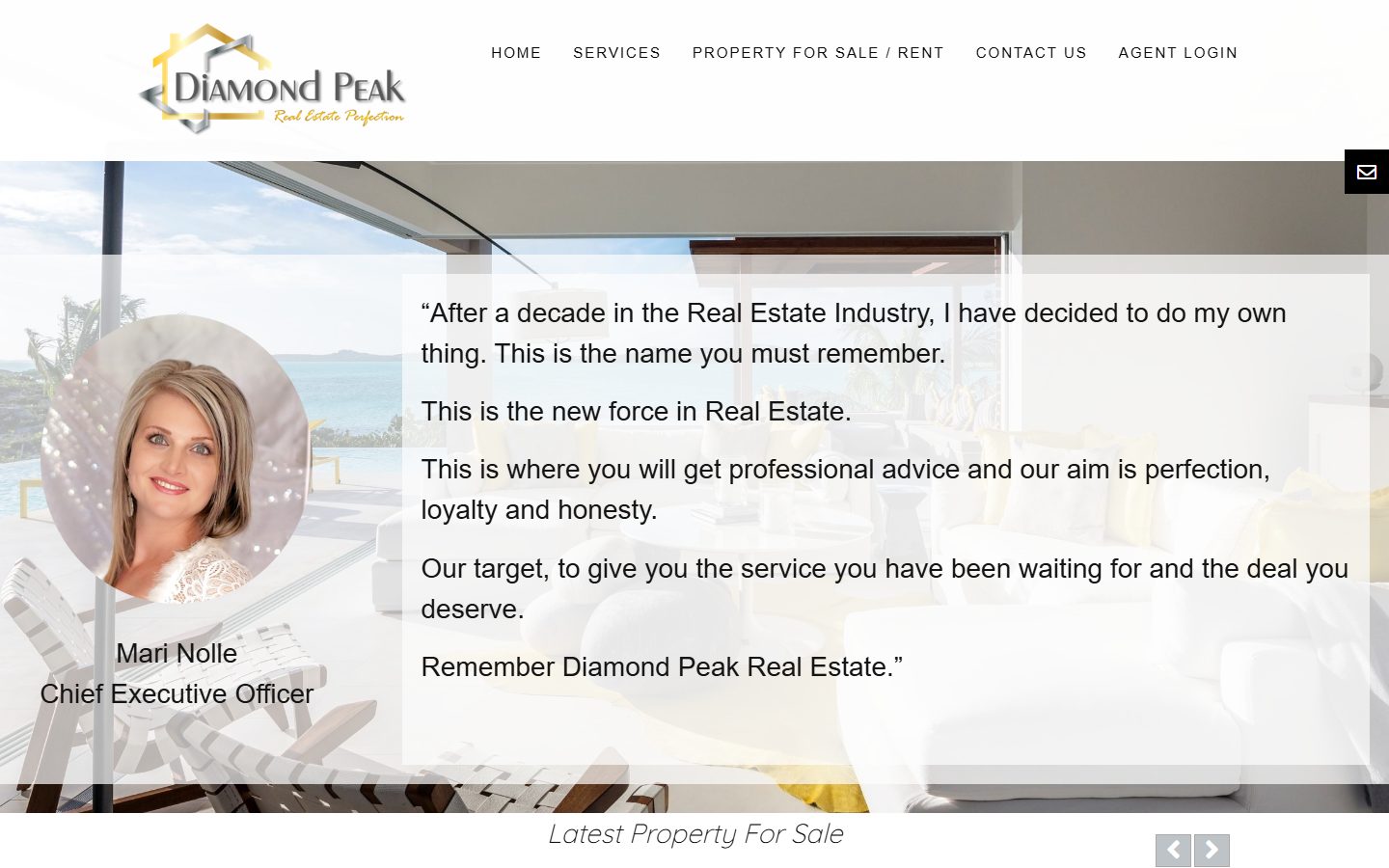
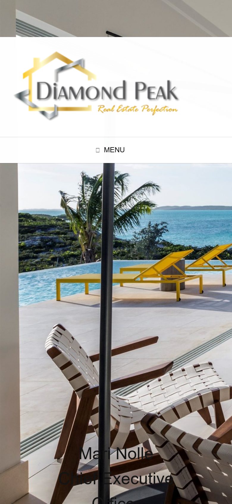
↑ Diamond Peak's website before, on desktop and phone
Approach
One foundation, built in order.
- 01
Discovery
Audit of the old site · What buyers in her area search for · Local competitors · Mari's story and voice
- 02
Brand
Logo refresh · Logo family for every size · Colours, type and photography direction
- 03
Website
Homepage · Property search · Listing pages · Services · Areas and suburbs · Bond calculator · Blog · Holiday seasons · Afrikaans · Stress testing
- 04
Everywhere else
Brand kit · Email signature · WhatsApp stickers · Google Business Profile · One business number
- 05
Looking after it
Updates, backups and security · Changes when listings change · A heads-up before every holiday · Twice-yearly review
Discovery
Written for how South Africans search.
South Africans search for "property" and an "estate agent", not "real estate". So every page is written around the words her clients actually type, one search phrase per page, the same way her Google Business Profile describes her services and areas.
What that meant
- A page per serviceSelling, buying, renting, maintenance and renovations each get their own page.
- A page per areaPretoria North, East, West, South and Centurion, each with its own suburbs and landmarks.
- A page per suburbFrom Amandasig to Wonderboom, so a local search lands on a local page.
Research and inspiration
First, who else is out there.
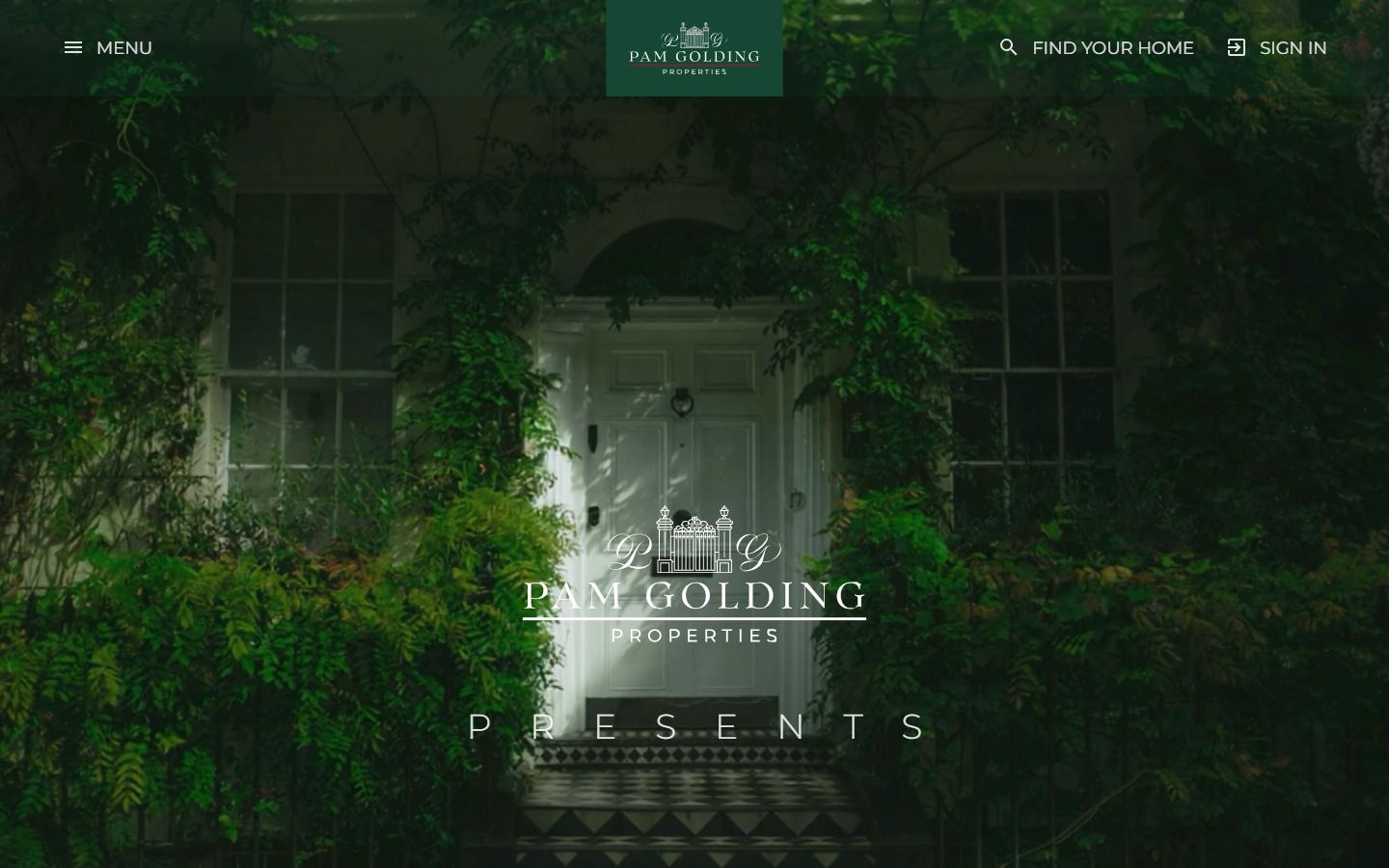
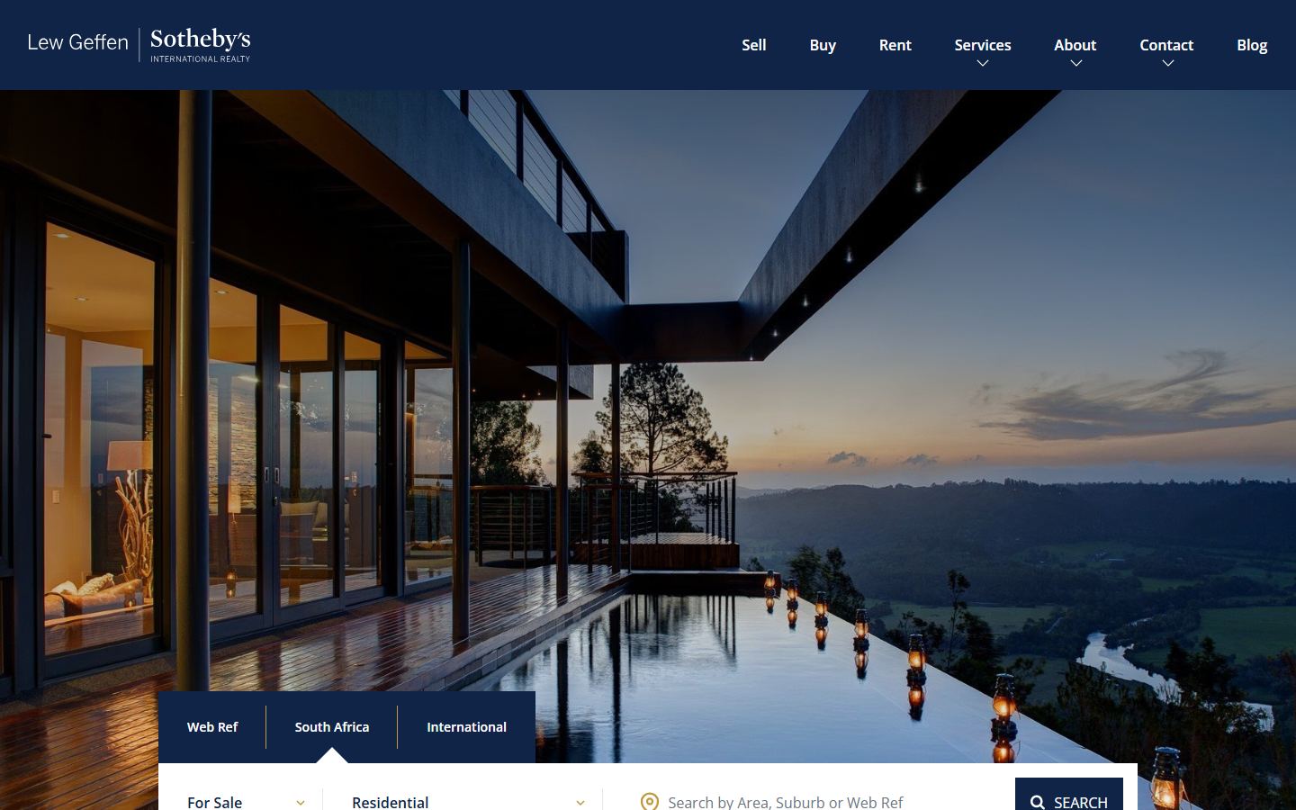
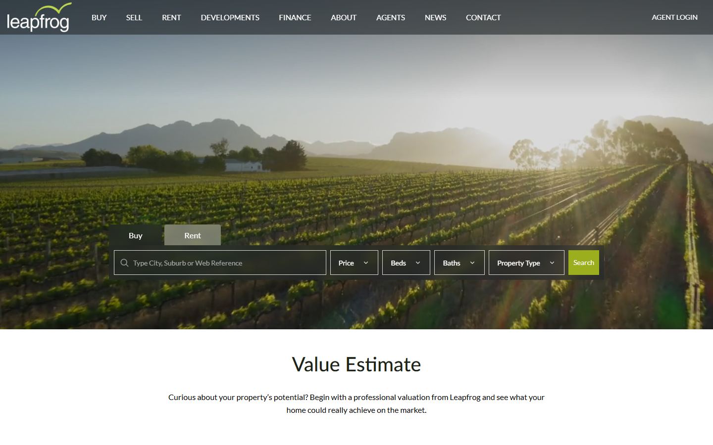
Before designing a thing, I looked at the big agencies Mari competes with for the same buyers and sellers.
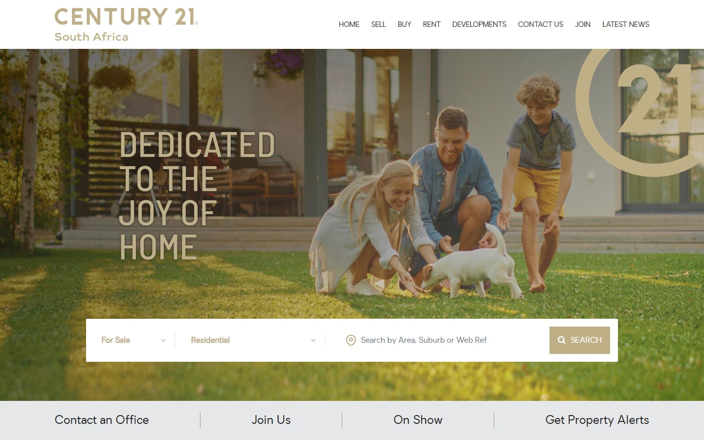
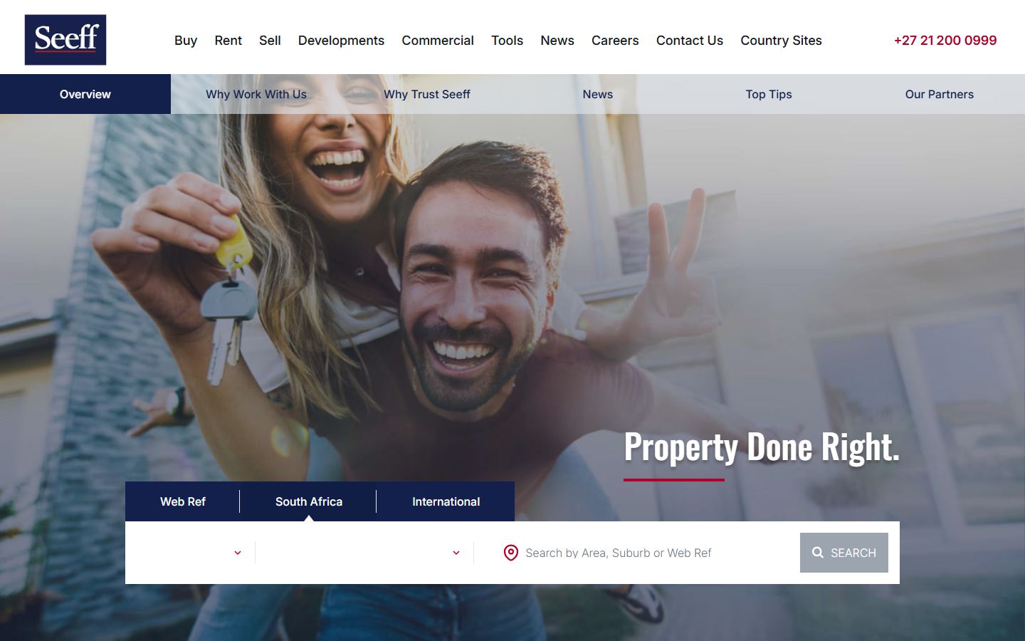
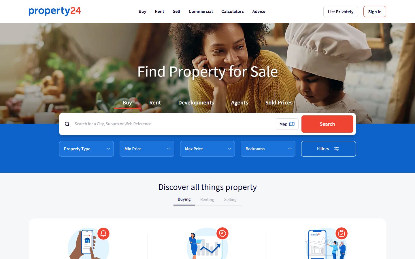
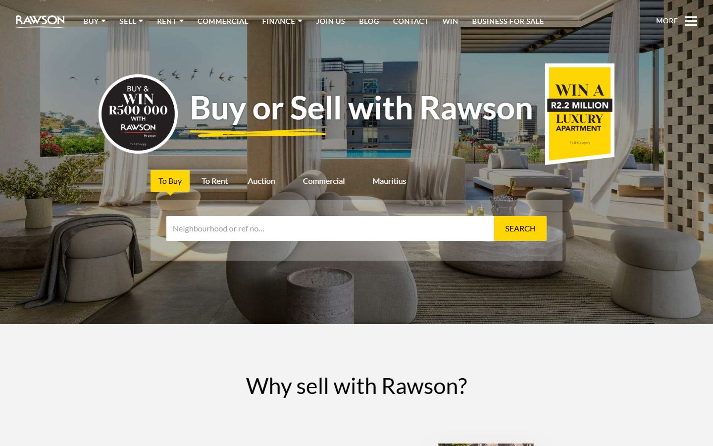
Then, the world outside the screen.
A brand for a Pretoria estate agent called Diamond Peak should feel like Pretoria, and like diamonds. So the moodboard came from real places and real stones.
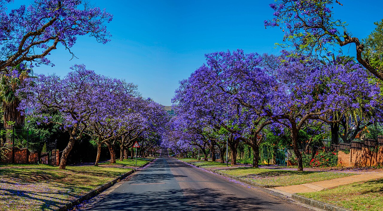


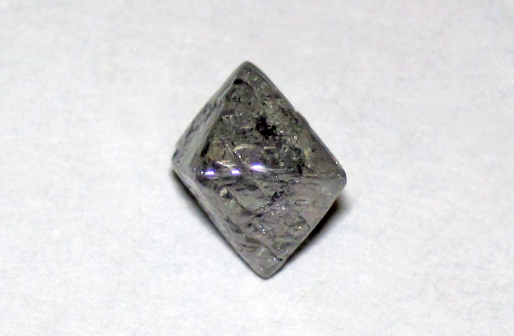
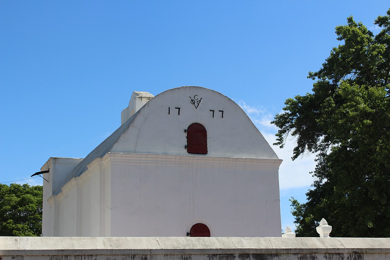
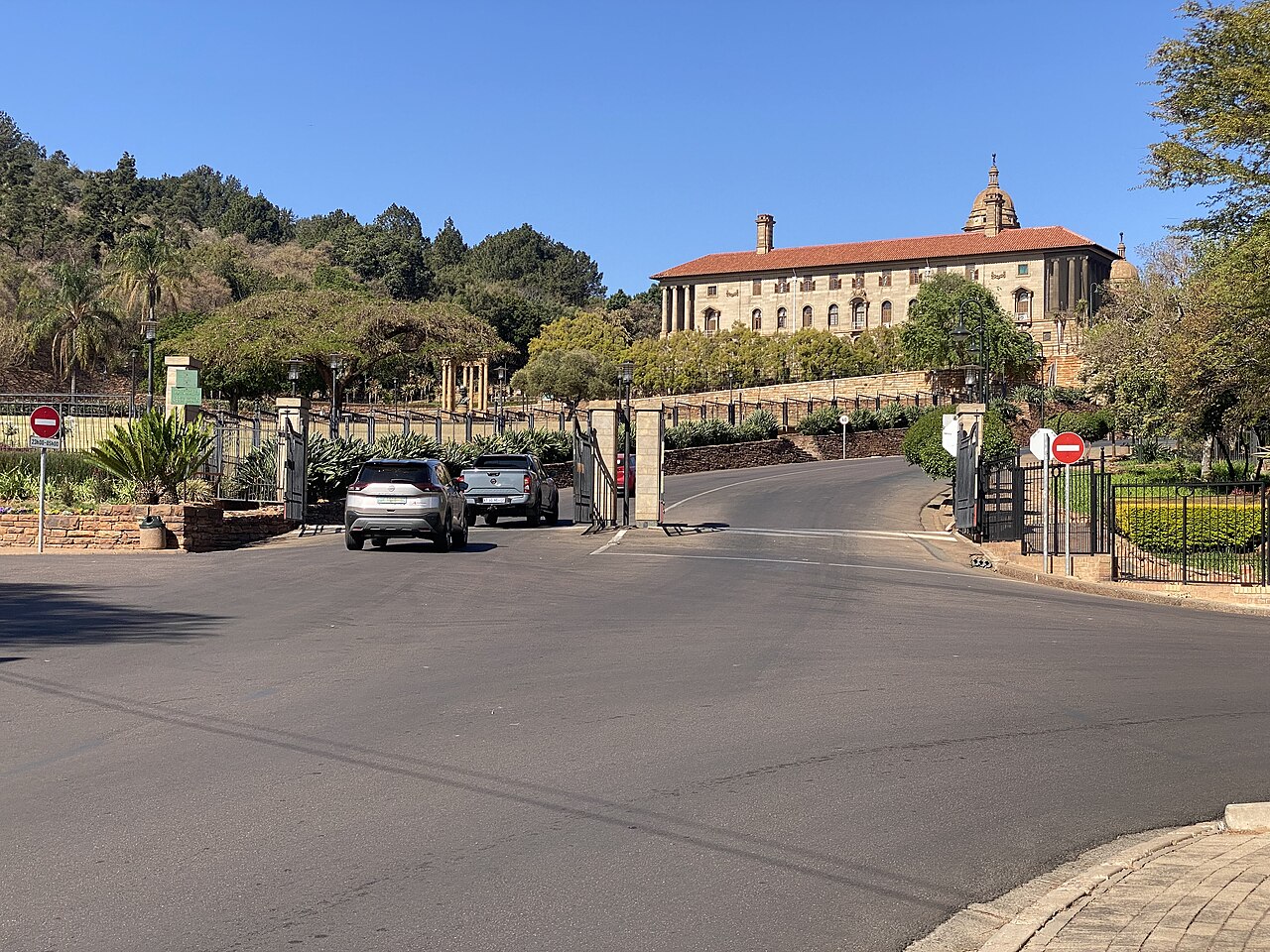
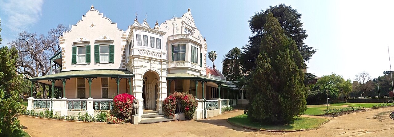
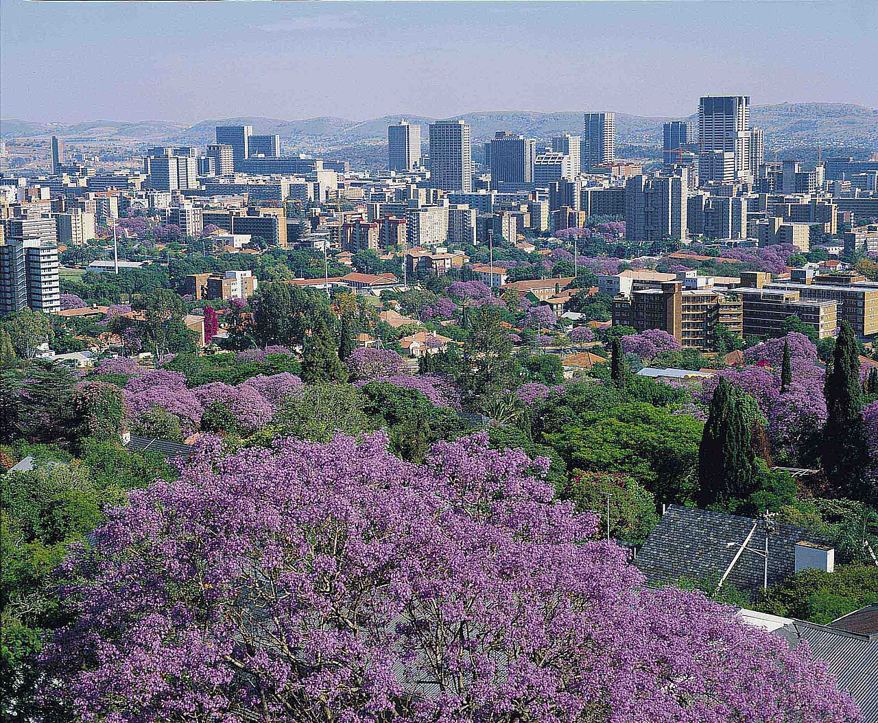
Photos from Wikimedia Commons: Union Buildings by Ruby D-Brown (CC BY 4.0) · Becket Street jacarandas by Paul Saad (CC BY-SA 4.0) · Cullinan replica by James St. John (CC BY 2.0) · brilliant cut by Petragems (CC BY-SA 4.0) · Melrose House by Leo za1 (CC BY-SA 3.0) · Cape Dutch gable by Martinvl (CC BY-SA 4.0) · Pretoria skyline by South African Tourism from South Africa (CC BY 2.0) · rough diamond by James St. John (CC BY 2.0)


Journey mapping
Two kinds of client. Two straight paths.
Before drawing anything, I mapped how Mari's two kinds of client get from a Google search to her phone. Every page on the site exists to move someone one step along one of these paths.
The buyer
- Searches"houses for sale in Pretoria North"
- Lands onan area page written for that part of Pretoria
- Browseshomes, filtered by area, type and price
- Checksroughly what the bond would cost a month
- Calls or WhatsApps Mariin one tap, from any page
The seller
- Searches"sell my house Pretoria North"
- Lands onher sell-your-house page
- Readshow Mari sells a home, step by step
- Seesthe homes she's selling right now
- Asks for a valuationstraight from Mari, by phone or WhatsApp
Sitemap
Every page, and why it's there.
Four doors off the home page: the homes, what Mari does, where she works, and help for buyers and sellers. Every page is a tap or two from the menu.
- Homes for sale
- Homes to rent
- A page per home, with gallery
- Sell your house
- Buy a house
- Houses to rent
- Maintenance
- Renovations
- 5 regions of Pretoria
- 44 area and suburb pages
- Map on every one
- Advice (blog)
- Bond calculator
- About Mari and contact
- Privacy, cookies, PAIA, terms
And all of it again in Afrikaans, page for page.
Sketches
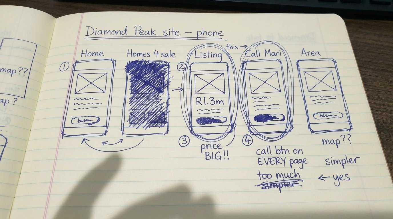
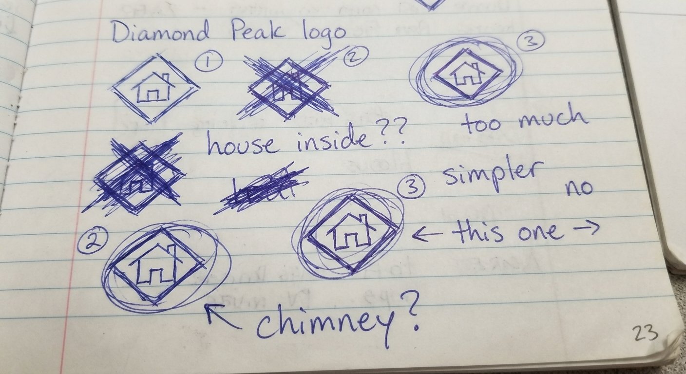
Pencil first.
Pen and paper before any design, because ideas on paper are cheap to throw away.
Wireframes
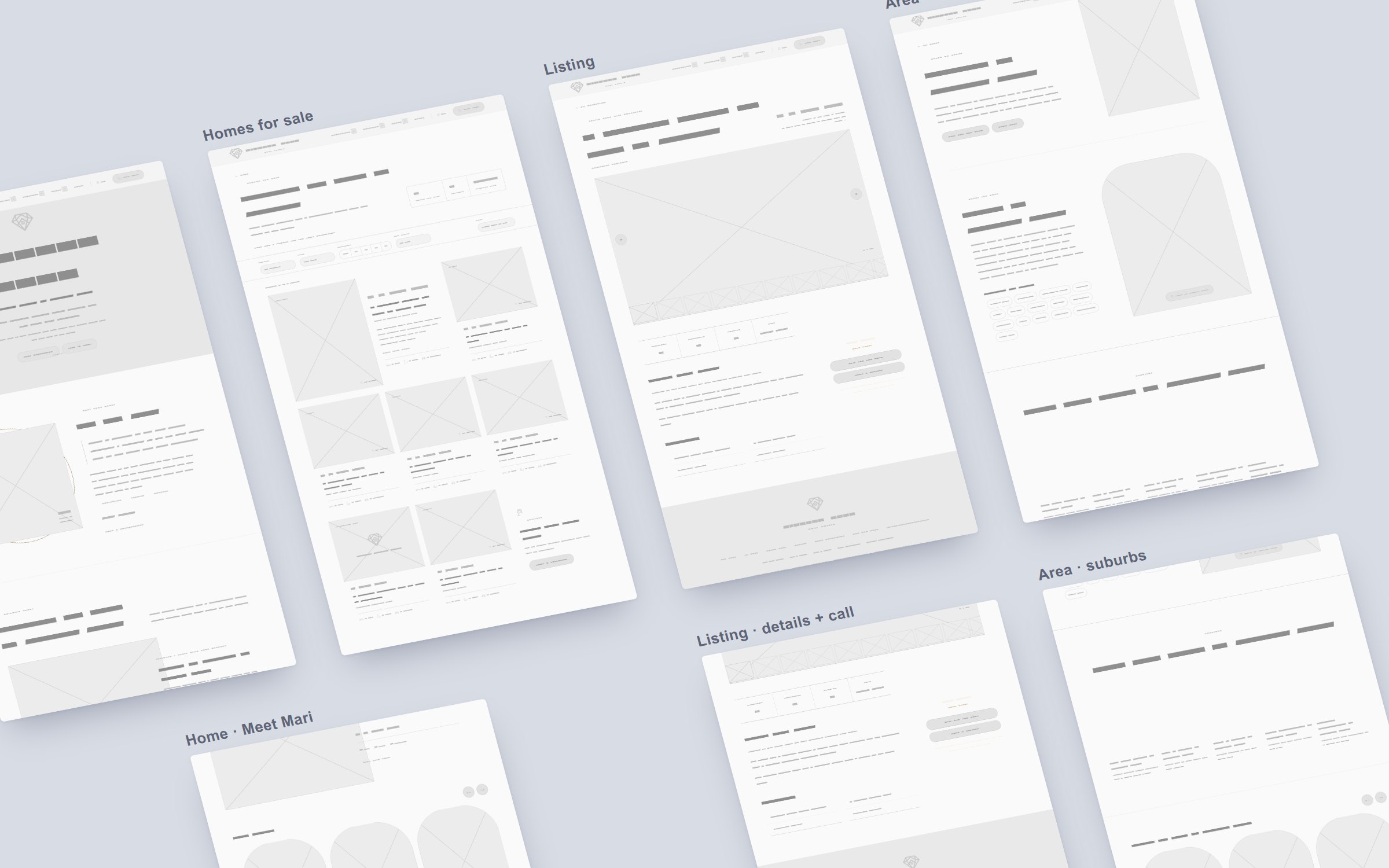
Then the bones.
Grey boxes before colour and photos: where the search sits, how the homes line up, and the price and Call Mari up front on every listing.
Colour
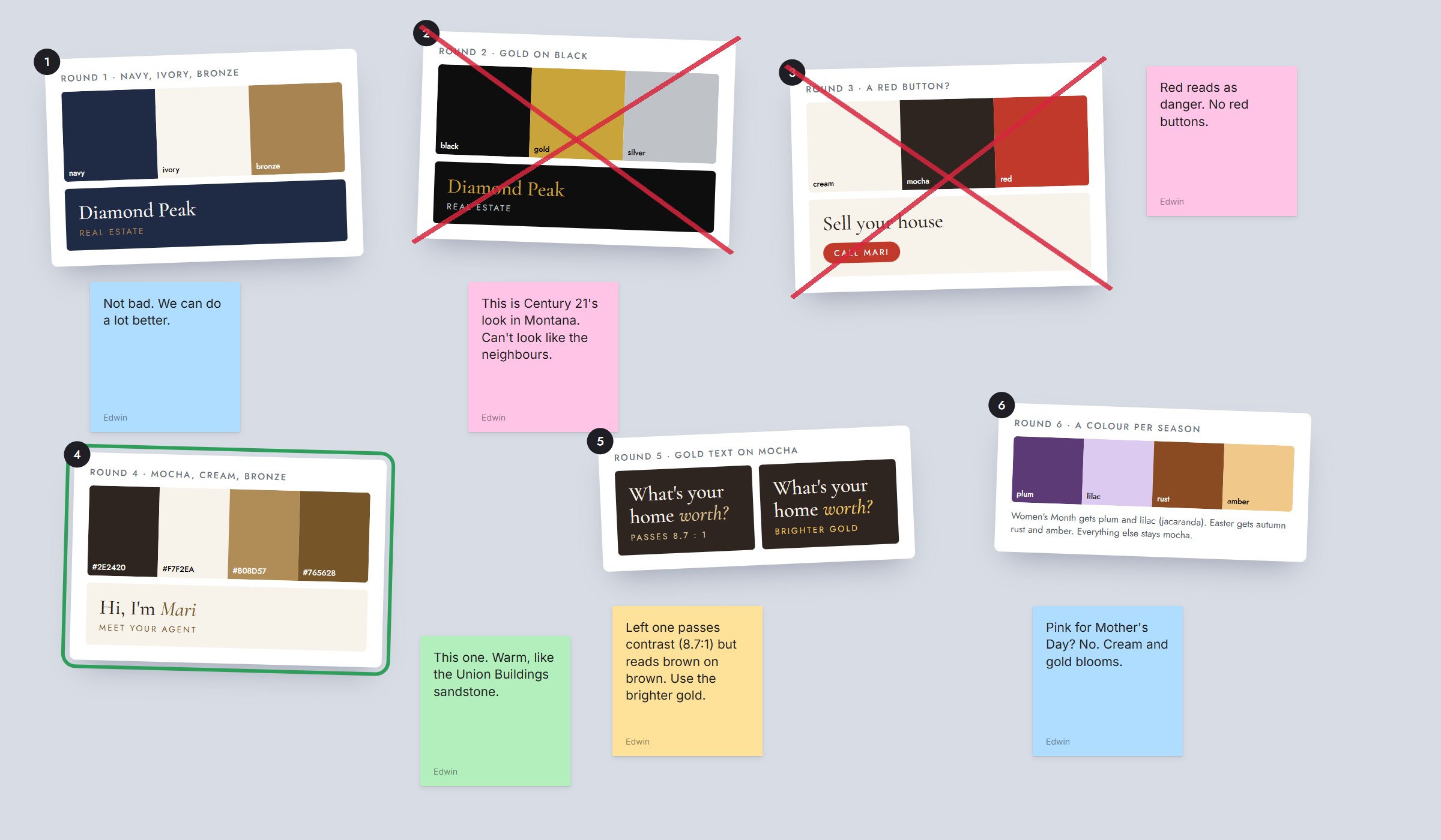
Colour was a mission.
Six rounds. Navy was "not bad". Gold on black looked like the agency down the road. A red button looked like a warning. Mocha and cream finally felt like Pretoria sandstone, and then the gold still read as brown on brown until I made it brighter.
The logo, the long way
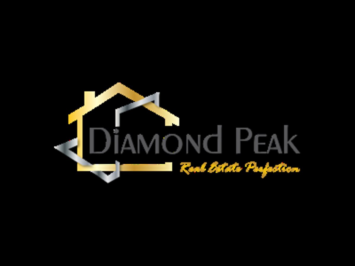
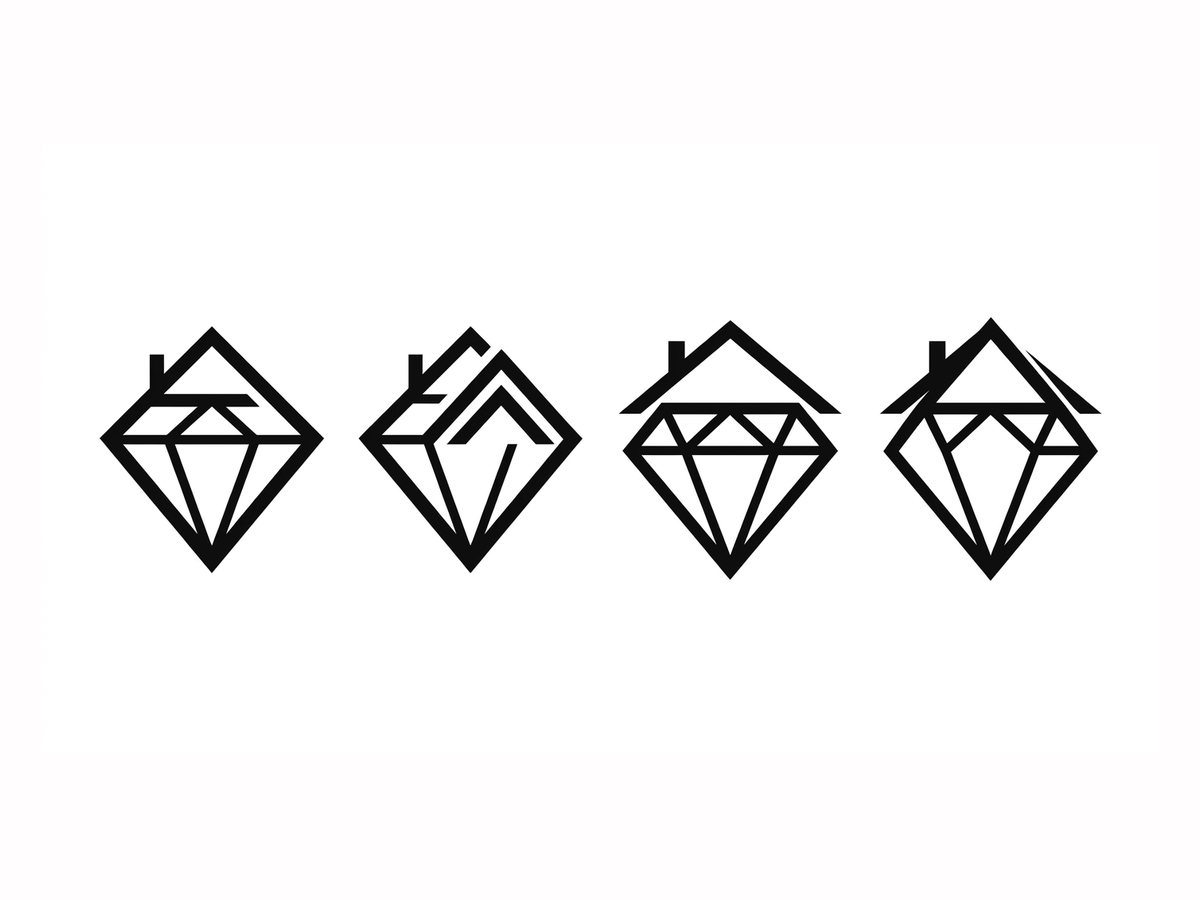
Over 100 logos that didn't make it.
Some were close. Some were terrible. Every round taught me something about what Mari's logo had to do: stay sharp on a sign, stay readable on a phone, and still feel like hers.
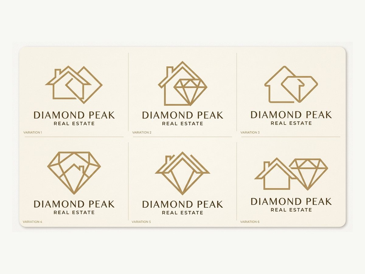
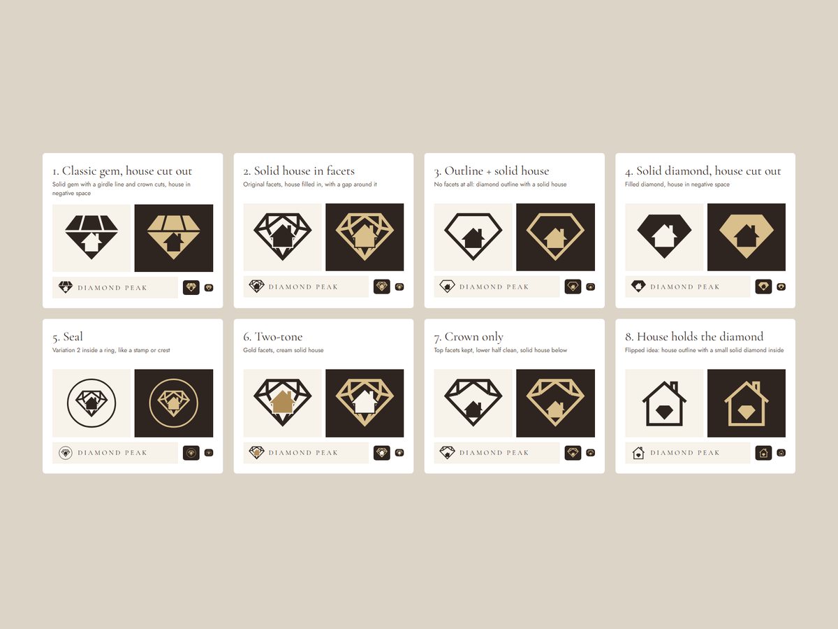
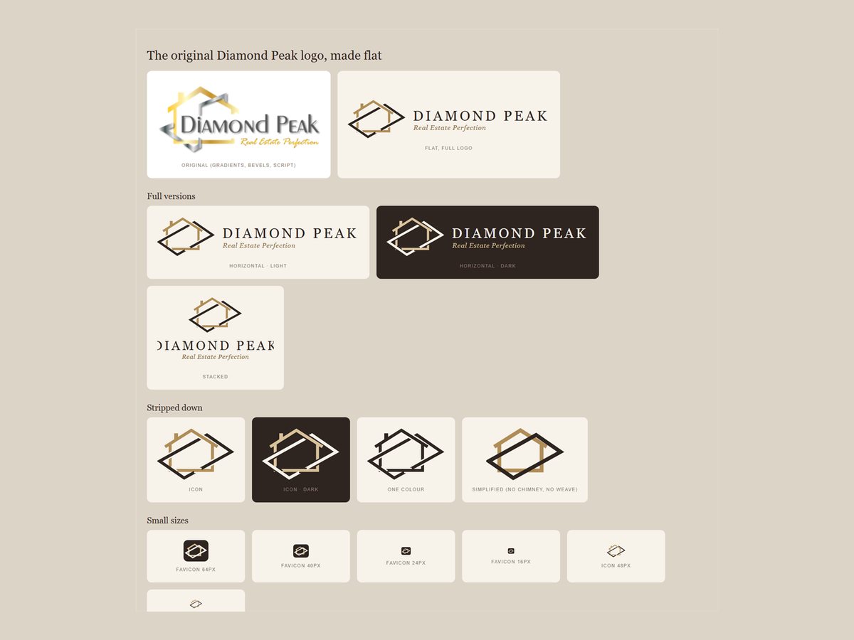
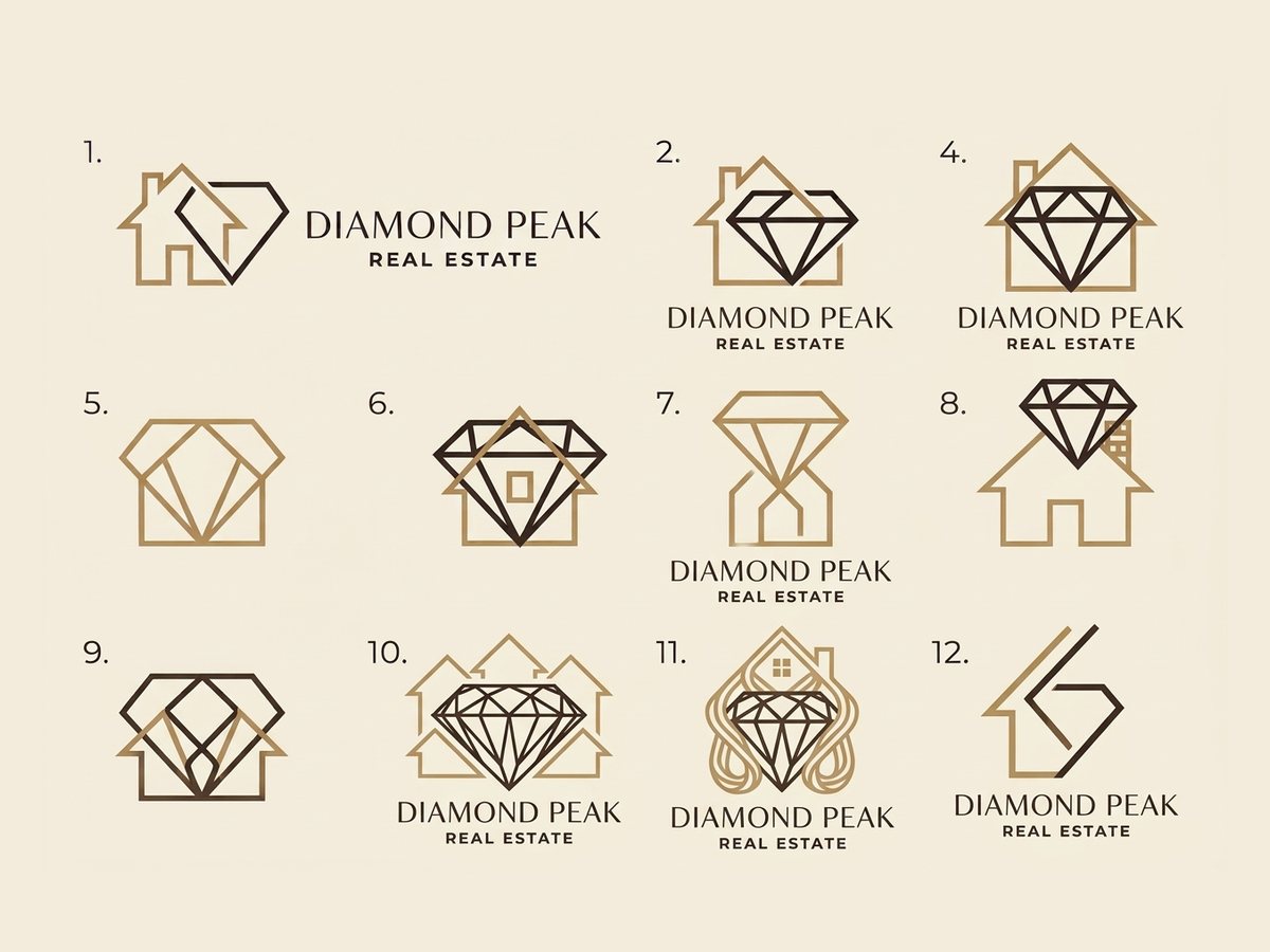
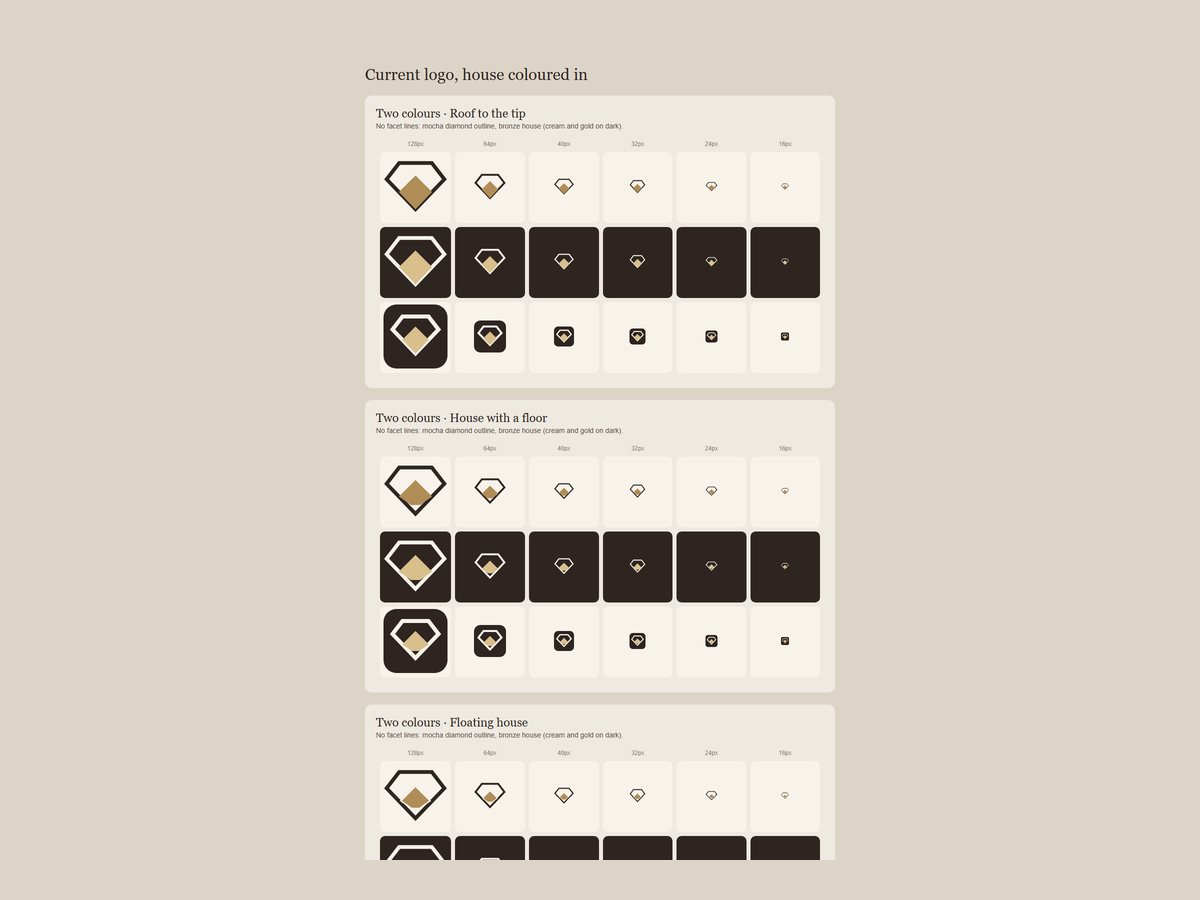
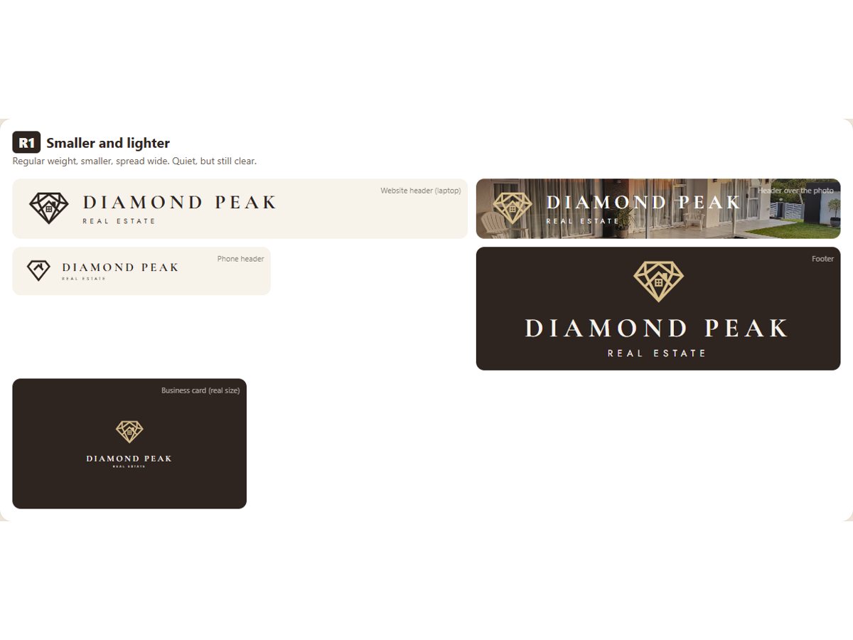
Where it landed: her own diamond and house, redrawn as one clean line mark. ↓
The solution
A brand that finally matches the service.
Brand
The logo, refreshed
I kept what Mari's clients already knew, a diamond with a home inside it, and redrew it as a clean line mark that works on a sign, a card and a phone screen.
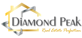 Before
 After
Brand
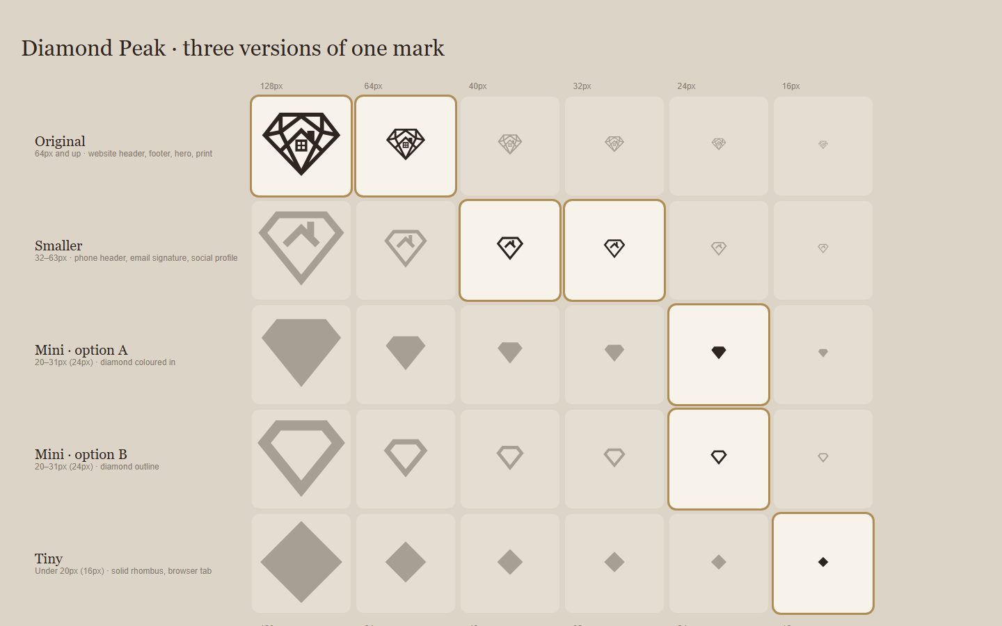
One mark, every size
A full logo doesn't survive at 16 pixels. So the mark simplifies as it shrinks: the full diamond for the website, a lighter version for her signature and social profiles, and a solid diamond for the browser tab.
Brand
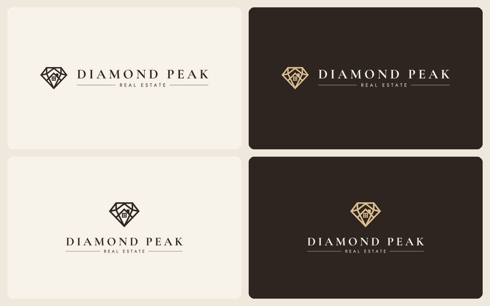
Wide, stacked, light and dark
Wide for her website and email. Stacked for social profiles, boards and anything square. Each one for light and dark backgrounds, plus plain black and white for the printer. So her logo never gets stretched, squashed or lost on the wrong colour.
Website
Homepage
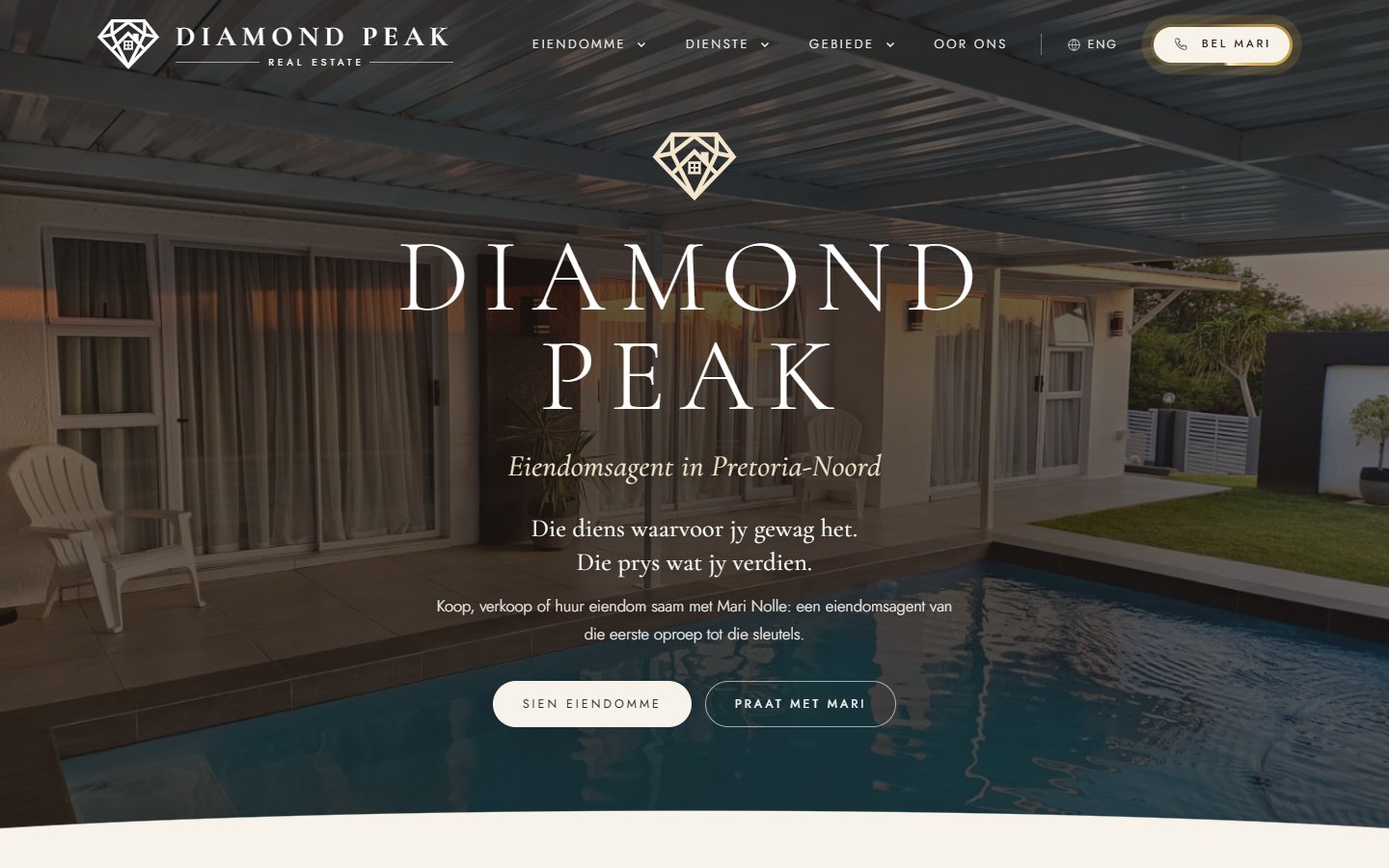
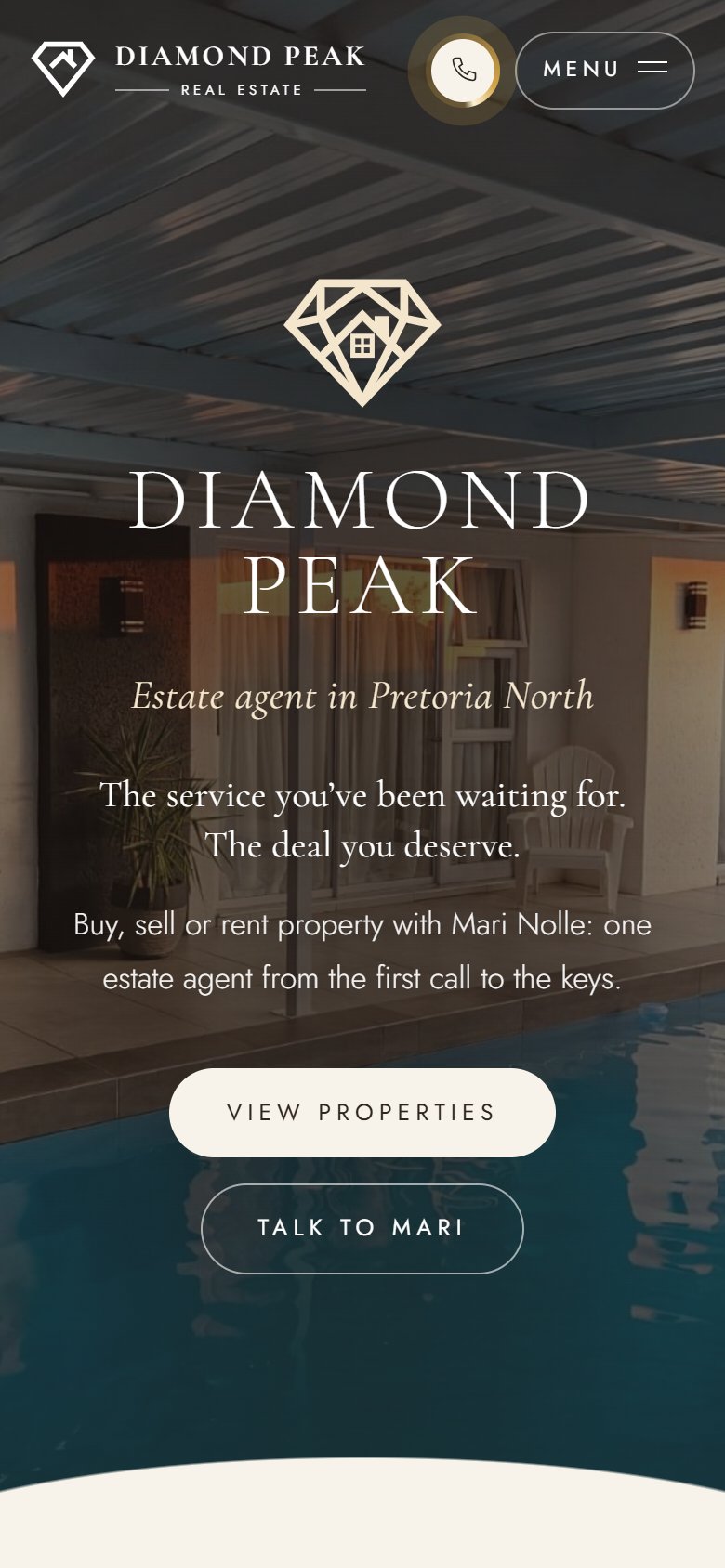
A real Pretoria home, Mari's name and her promise up front: "The service you've been waiting for. The deal you deserve." Call Mari is one tap away on every page.
Website
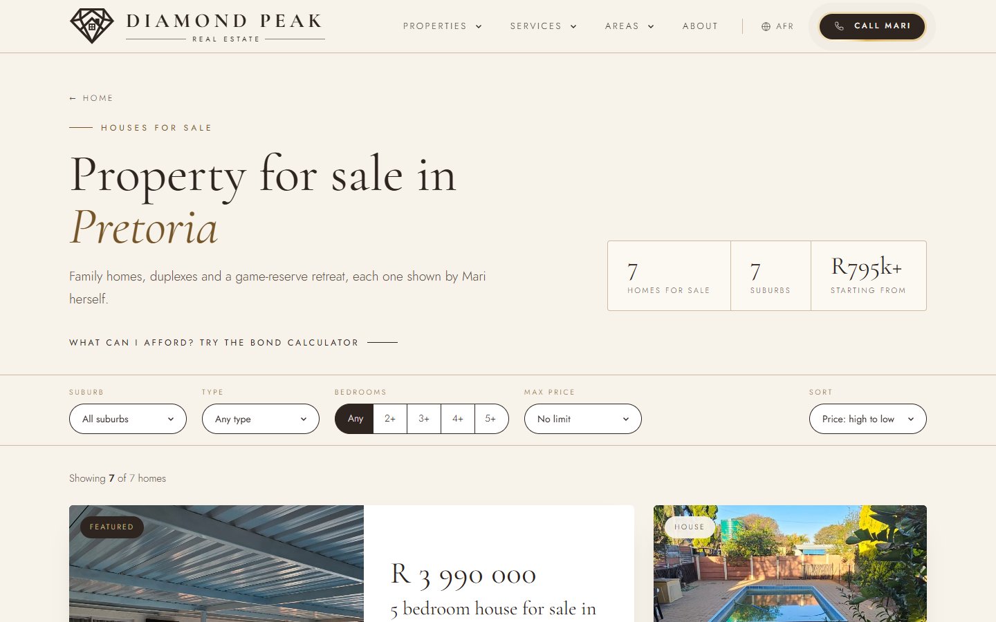
Property search
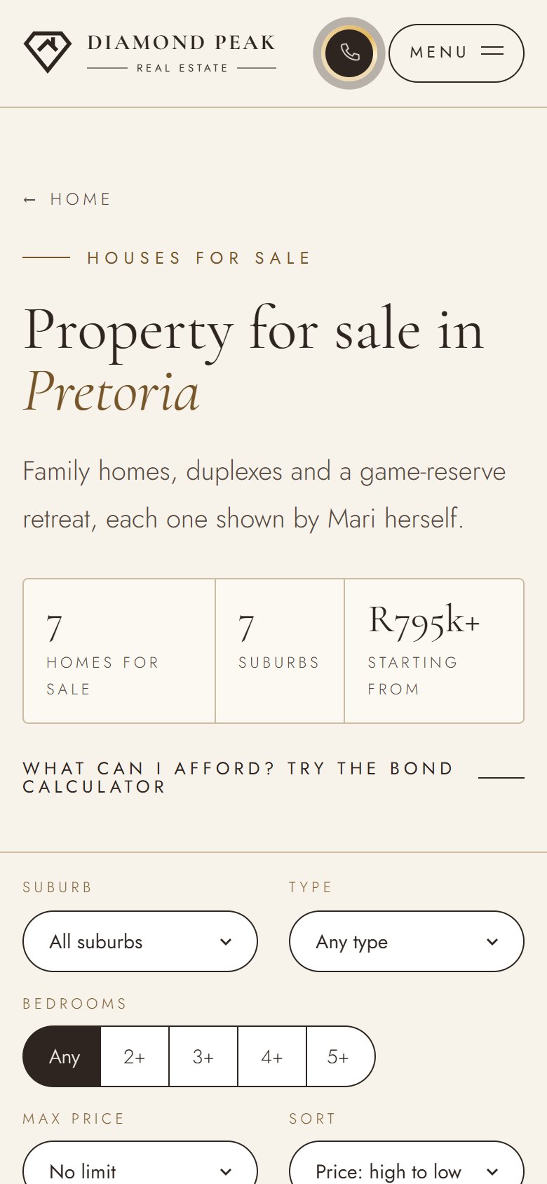
Filter by suburb, type, bedrooms and price, and sort the results, on a phone as easily as on a laptop.
Website
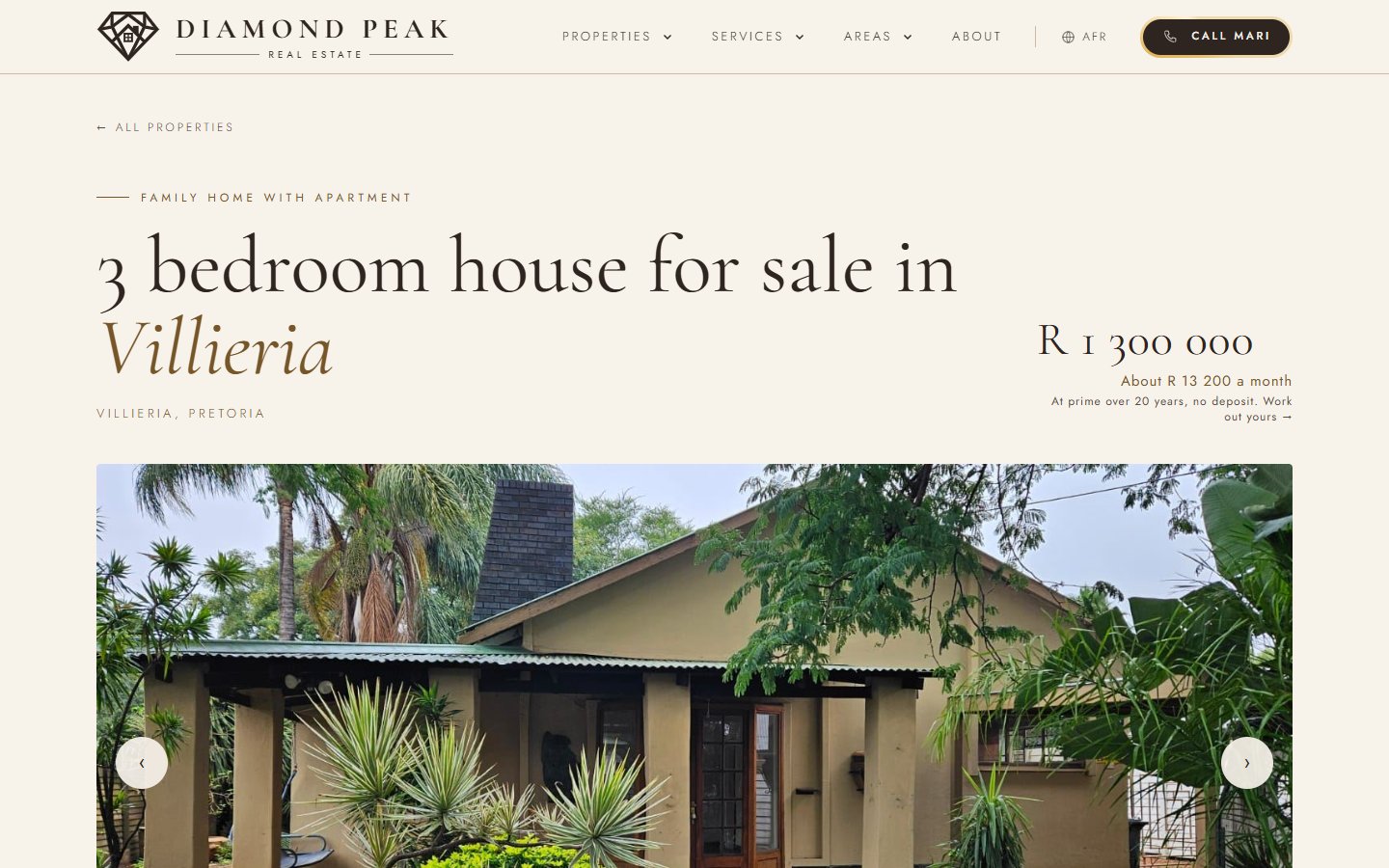
Listing pages
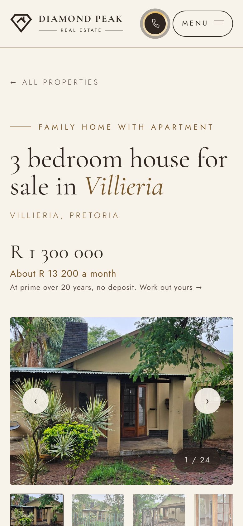
Every property gets its own page, with the price up front, a full photo gallery and a direct line to Mari.
Local search
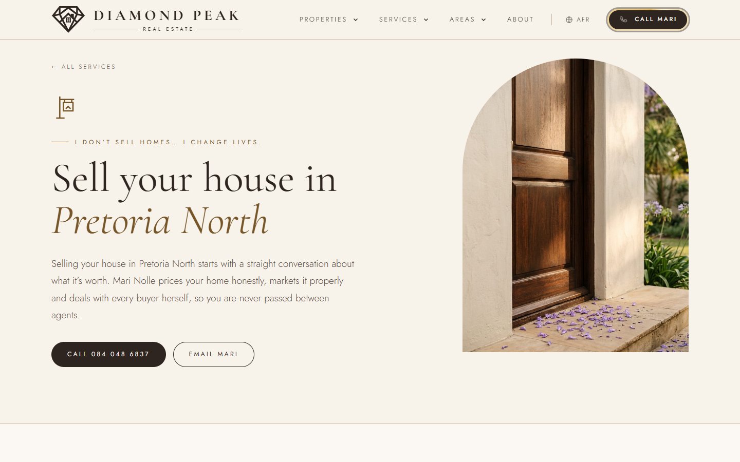
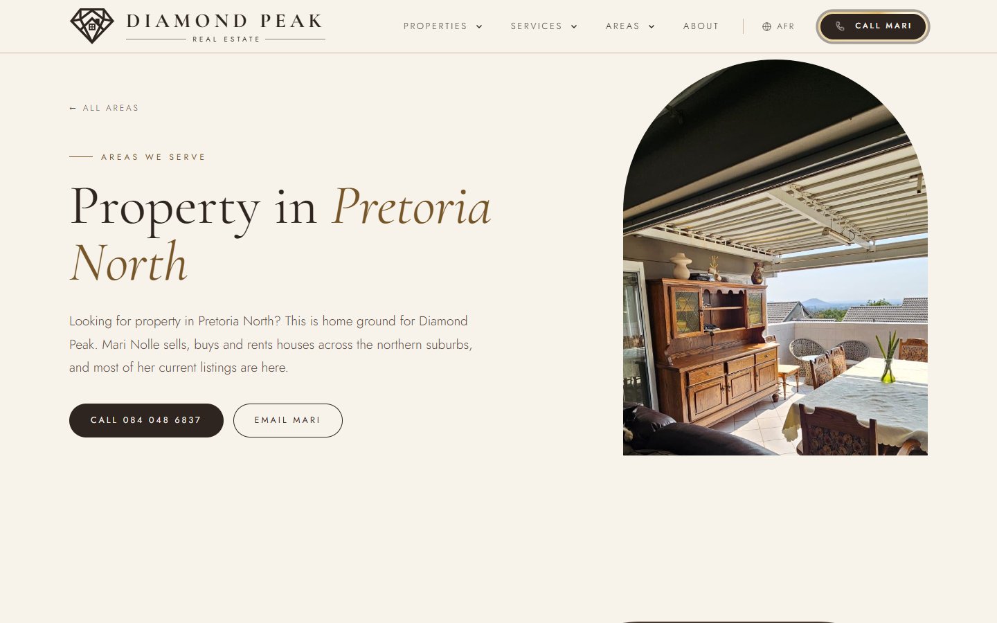
Services and areas
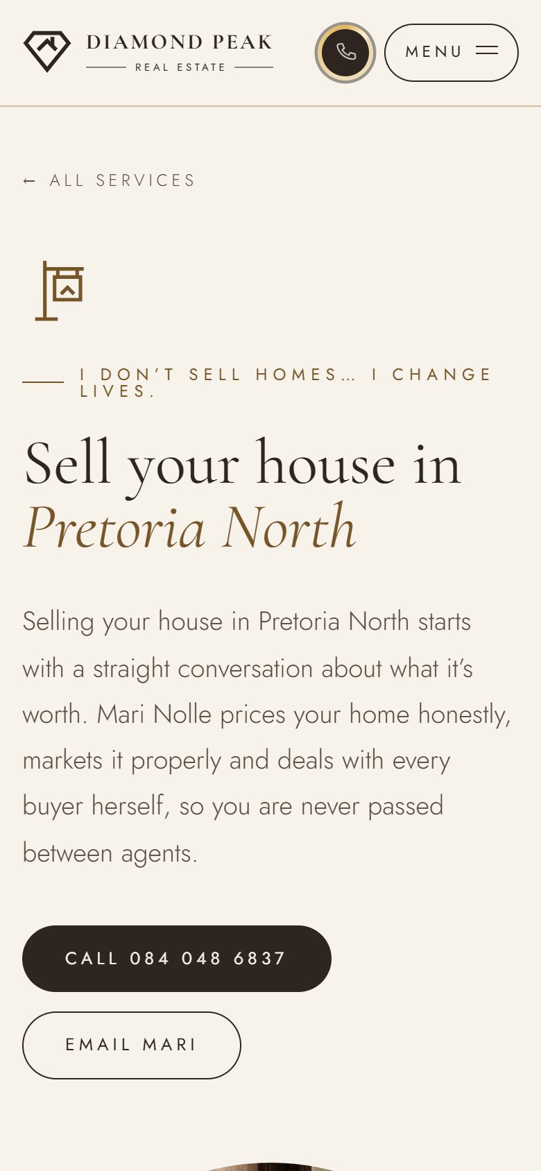
Each service and each region has its own page with real local detail, so when someone in Pretoria North searches for an estate agent, there's a page written for them.
Website
English and Afrikaans
Many of Mari's clients are Afrikaans-speaking, so the whole site exists in both languages, every page, every listing, with one tap to switch.
Everywhere else
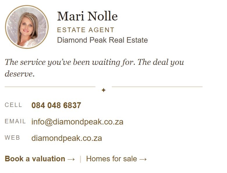
Email signature
Every email Mari sends now carries the brand: her photo, her promise, tap-to-call and tap-to-email, sized to fit any phone without zooming.
Everywhere else
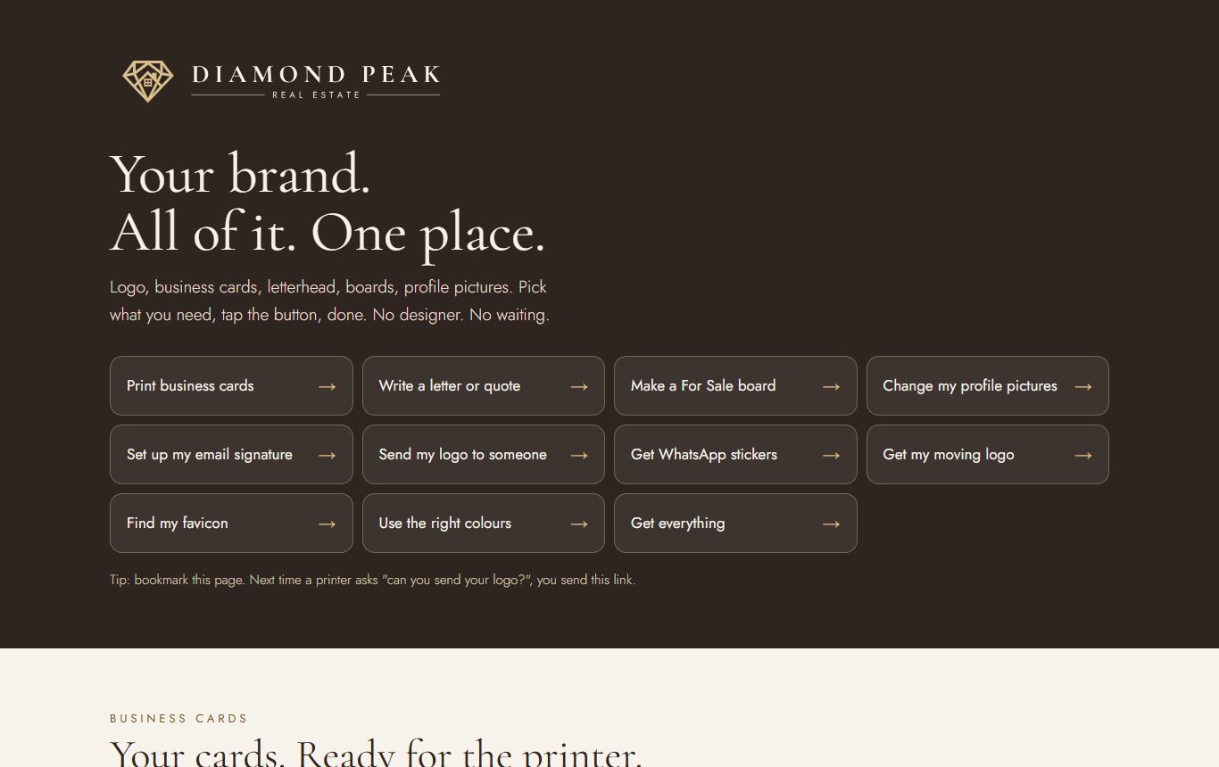
Her whole brand. One link.
Business cards, letterhead, For Sale boards, profile pictures for every platform, even WhatsApp stickers in English and Afrikaans. Mari taps what she needs and it's ready for the printer. When someone asks for her logo, she sends one link.
Website
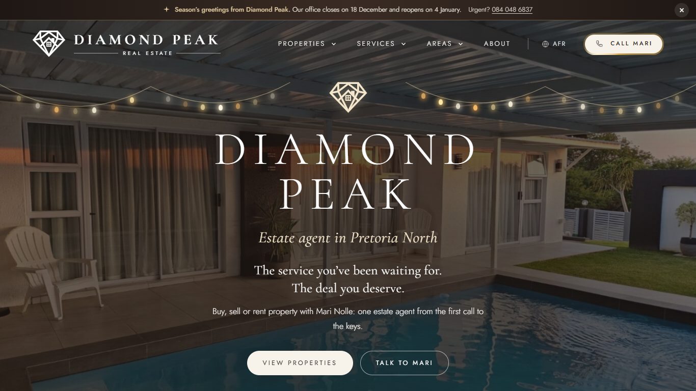
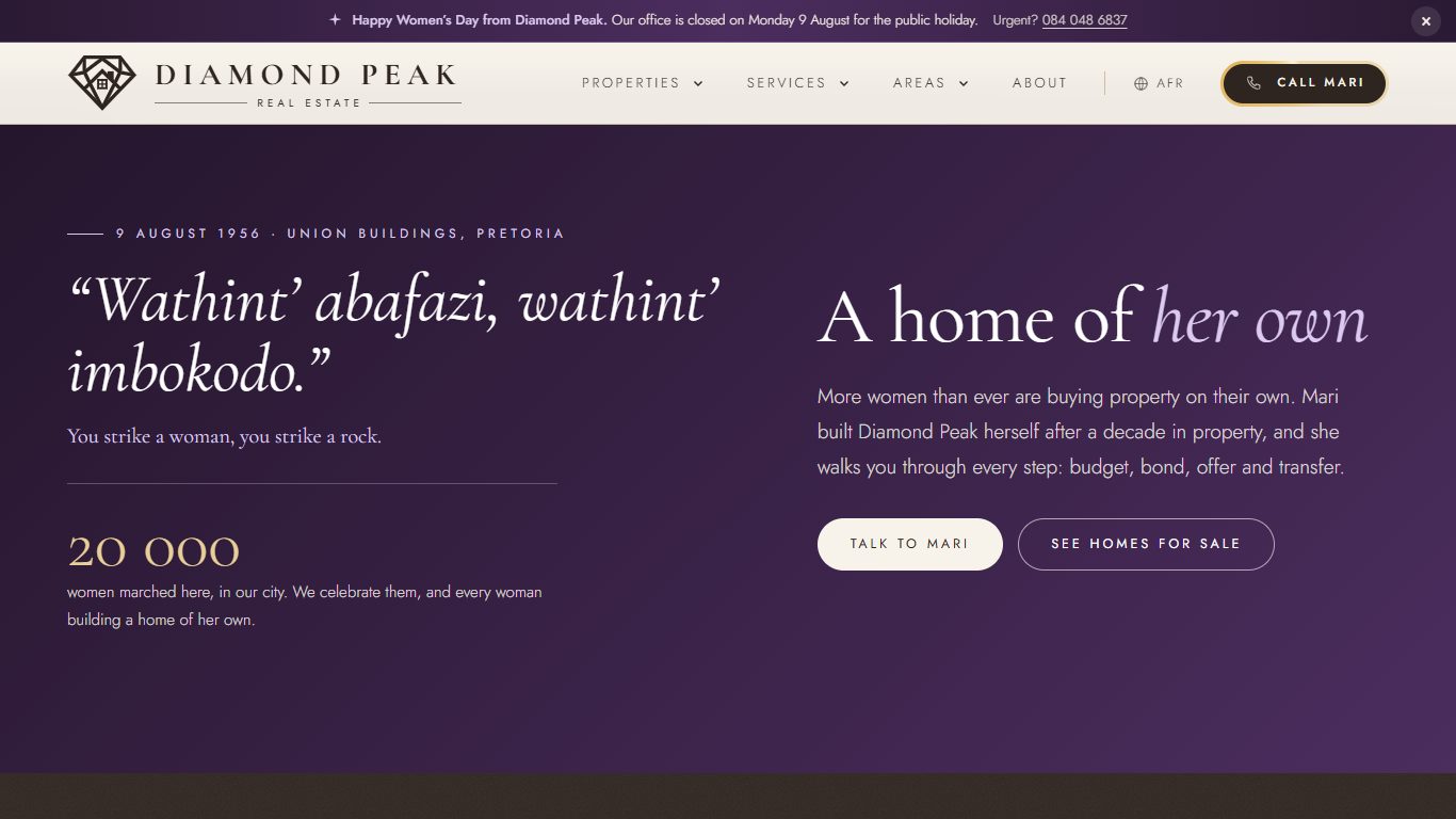
It dresses up for the holidays. By itself.
String lights in December. Autumn leaves at Easter. The words of the 1956 women's march in August. Her holiday hours go up on every page, in English and Afrikaans, and come down on their own. Mari just confirms her closing dates.
Website
Every holiday, worked out.
Easter moves every year. A holiday on a Sunday moves to the Monday. Freedom Day and Workers' Day get one notice, not two. The website works it all out, and nobody has to remember to switch anything on.
Peace of mind
The legal bits, done.
A privacy policy, cookie policy, PAIA manual and terms, written from the actual laws (POPIA, PAIA and the Property Practitioners Act), in both languages. And the safety stuff runs quietly in the background.
- "Registered with the PPRA" on every page, the way the law asks
- Password guessers get locked out
- Location data stripped from every photo before it goes online
- Spam protection on the enquiry form
Her dashboard
No clunky admin screens.
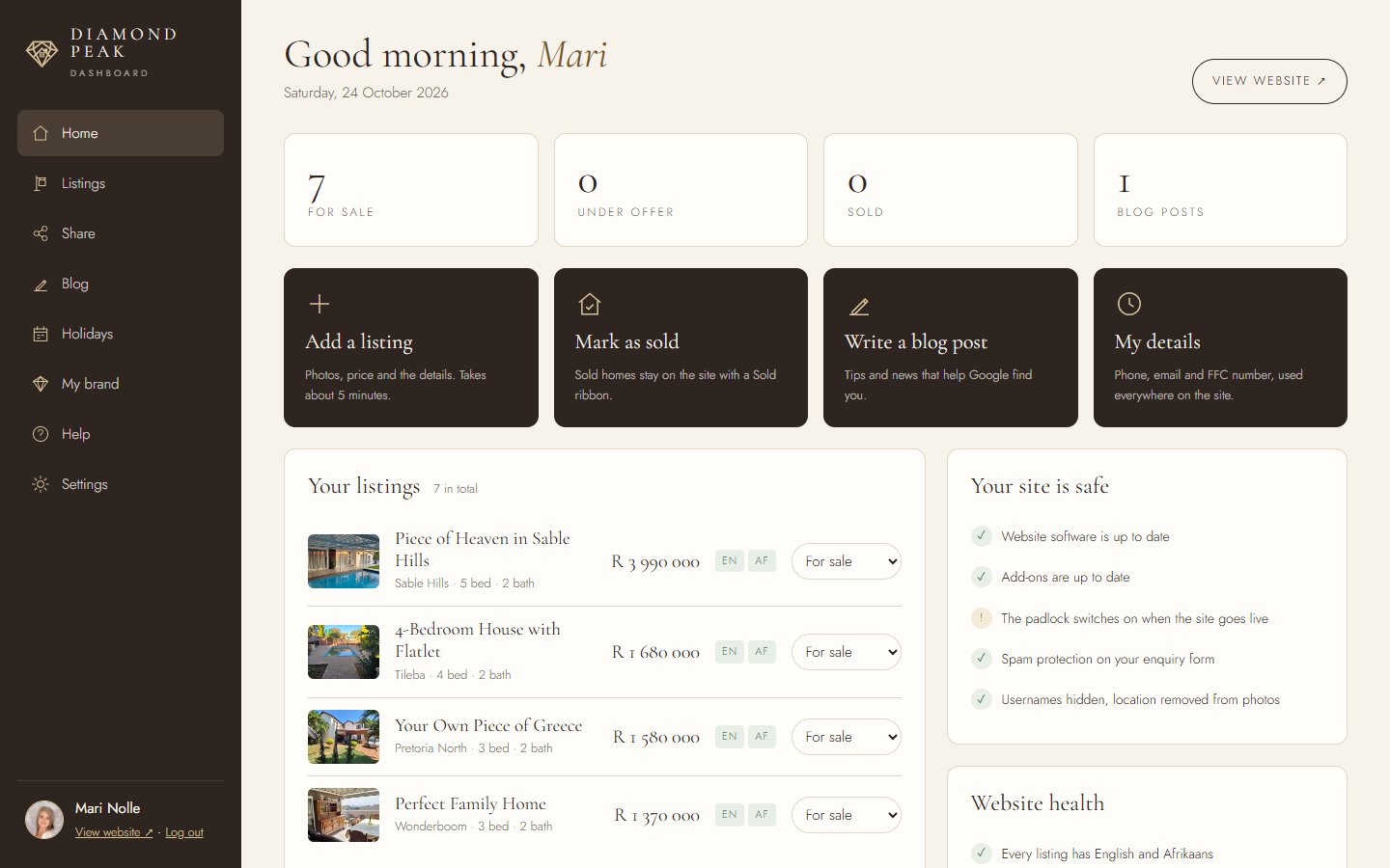
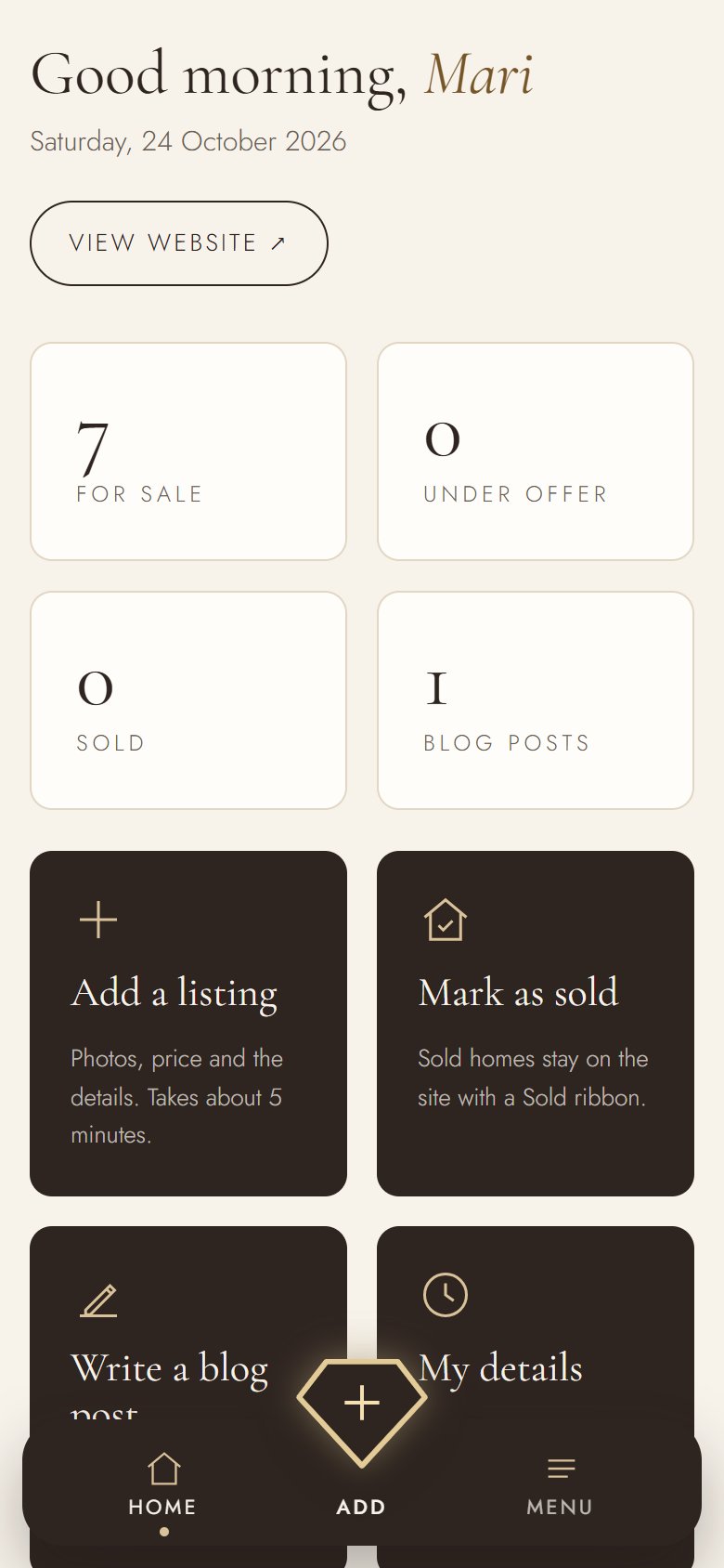
Most website back-ends are built for developers. Mari's isn't. Her dashboard speaks her language: add a listing in about five minutes, mark a house as sold, send a home to a buyer on WhatsApp, write a post. Every listing shows at a glance whether it has its English and Afrikaans version and its photos. It works just as well on her phone between viewings.
- Big, plain actions: Add a listing, Mark as sold, Share, Write a post
- Website health in plain words, like "Amandasig Retirement Home has no photos yet"
- Her brand kit and step-by-step help, one tap away
- Holiday dates: confirm in one tap, with a reminder before every public holiday
Built and working, and nothing she does can break the design.
Tested to break
I broke her website on purpose.
South African connections aren't always kind, and servers have bad days. So I built a simulator that loads Mari's site under the worst conditions I could think of, and designed what a visitor sees in every case. Nobody stares at a white screen or a broken page. They see her brand, and a way to reach her.

Real screenshots from the simulator, played back faster than real time. The clock shows how long a visitor would actually have waited.
Mobile
Most of her clients see it on a phone first.
So the phone wasn't an afterthought. Menus, galleries, filters and the call button were all designed for a thumb.
Key takeaways
What I took from this project.
Look like the business you are
Mari's service was already premium. The brand just had to stop hiding it.
Be specific to be found
A page for every service and area beats one page that tries to say everything.
One look, everywhere
Logo, website and email built together, so every touchpoint feels like the same business.
Built to be looked after
Mari changes her own listings, posts and holiday dates herself, and every update and fix is quick and safe.